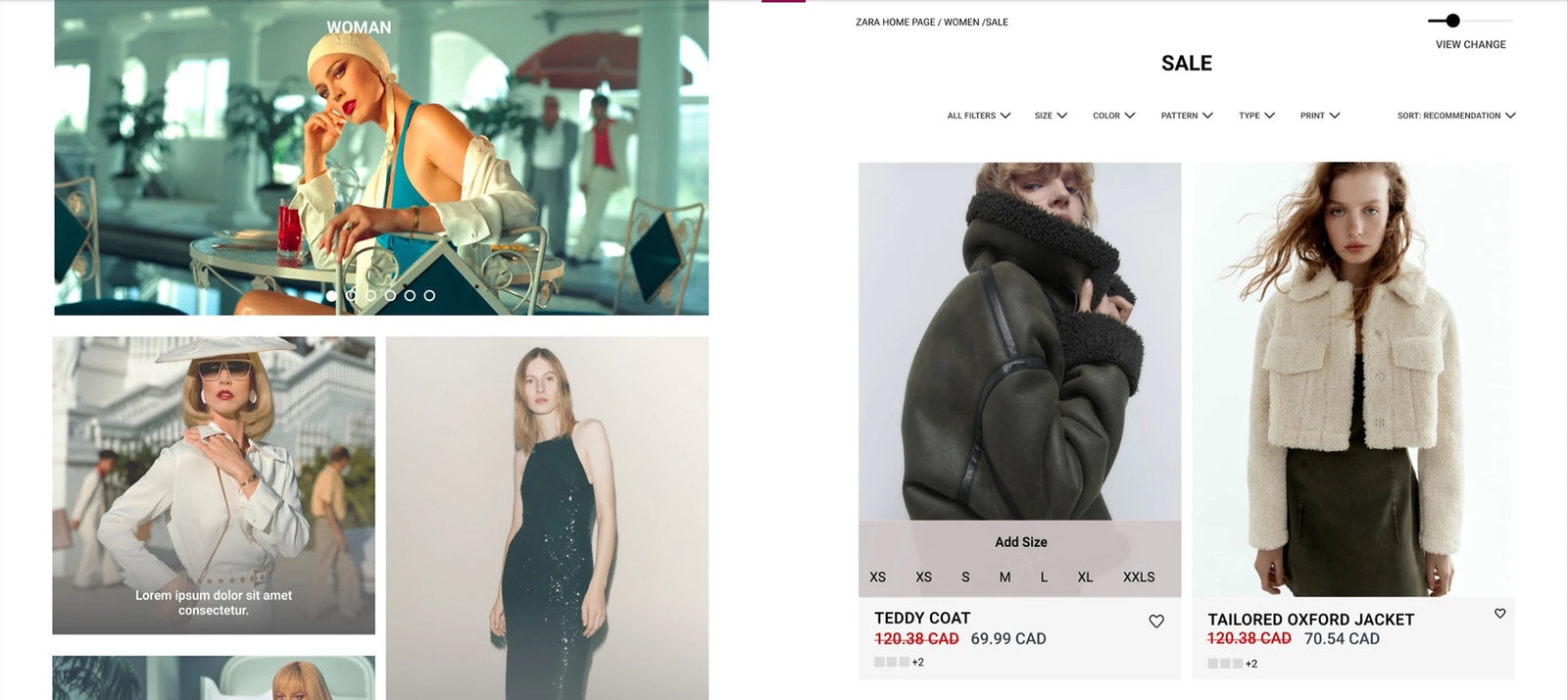
01 · The challenge
Understand the brand before reorganizing it.
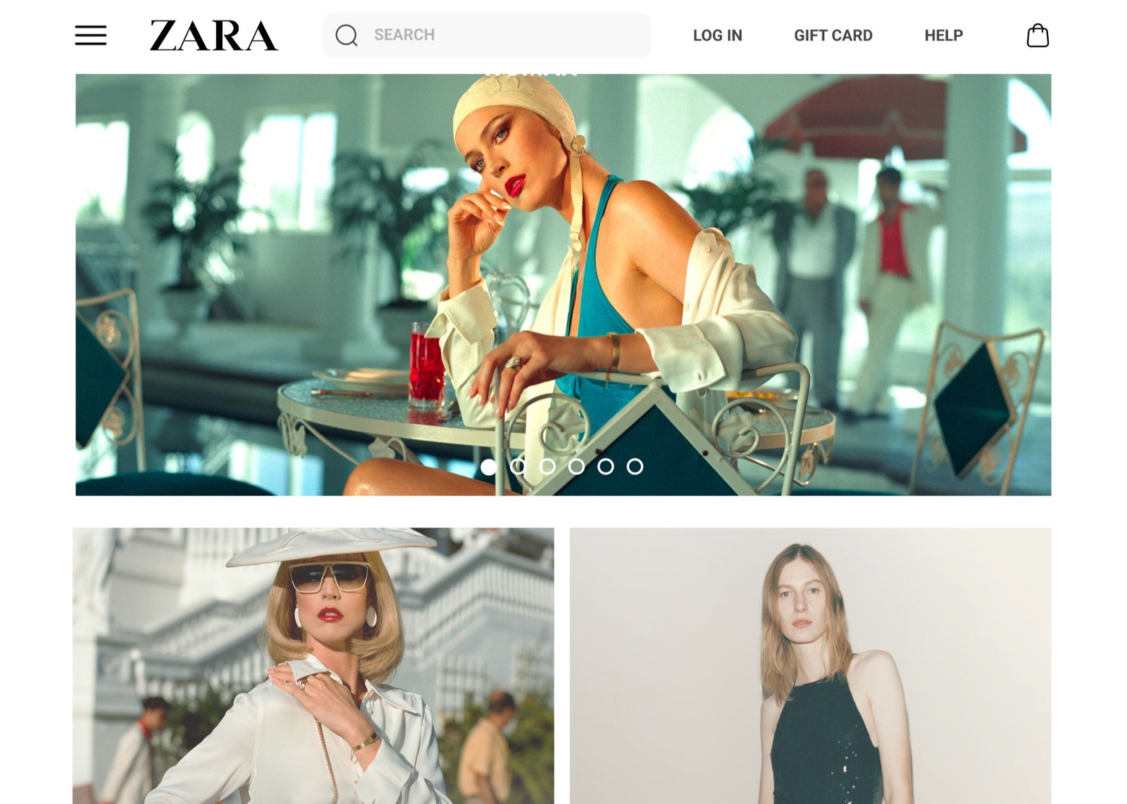
Our five-person team explored a balance between Zara’s editorial visual approach and the practical task of shopping. I contributed background research, a card-sorting session, tree-test analysis, and the sitemap redesign.
The research considered how the site’s presentation and terminology affected finding products, identifying sales, and changing items in the cart. The work was an academic information-architecture project in 2022.
02 · Research
Find where the language and structure break down.
We observed three participants completing three shopping tasks, then interviewed them about the experience. The tasks covered a housewarming gift, sale items, and changing a size in the cart.
The study surfaced difficulty finding sales, filtering and sorting, editing the cart, and understanding some labels and images.
- 3
- observed participants
- 6
- card-sort participants
- 10
- tree-test participants
In a hybrid card sort, six people outside UX organized 20 problematic labels. The exercise highlighted confusing collection names, ambiguity around “Home,” and utility items competing with shopping categories.
03 · The proposed structure
Separate shopping categories from the supporting tasks.
Research and competitor analysis informed three areas of change:
- Global navigation: retain the hamburger menu, move the gift card into utility navigation, and place organizational and support content in the footer.
- Organization: group collections rather than placing every category at the same level.
- Labels: explore clearer language such as “Zara Home” and “Partywear” in place of ambiguous alternatives.
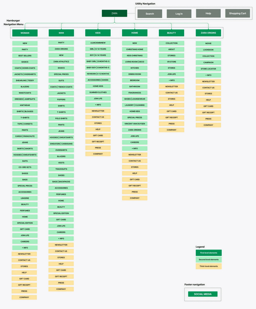
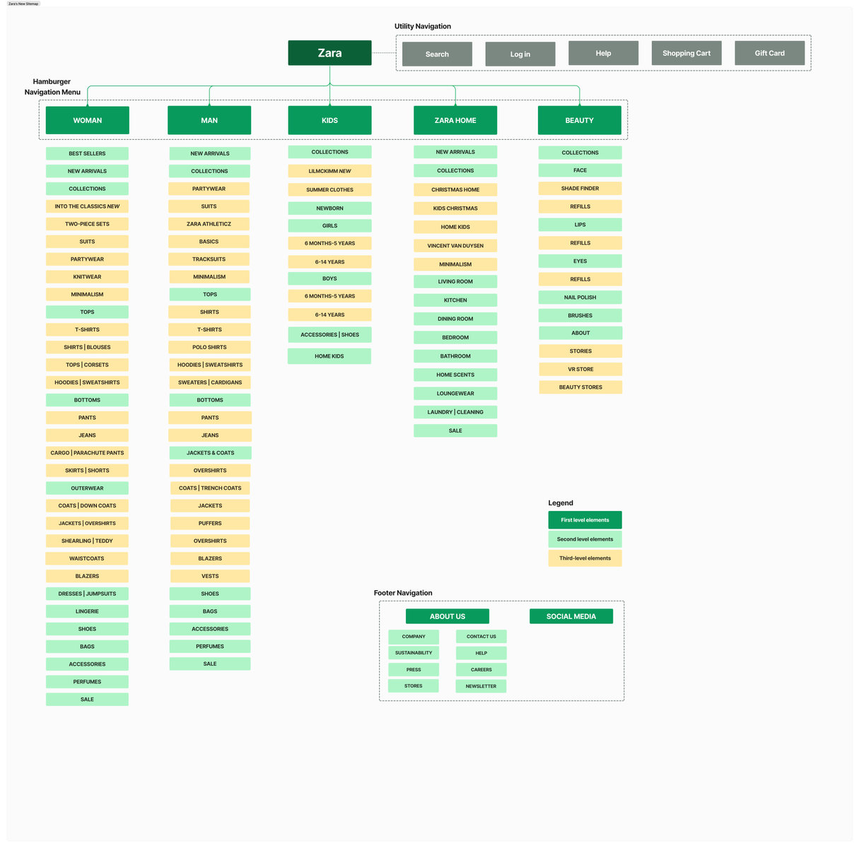
A stable “Collections” grouping was intended to reduce the need to relearn the navigation as new ranges appeared.
04 · Tree testing
Test the routes before polishing the screens.
Ten participants completed five tasks in a virtual tree test. The results informed further changes to the structure, rather than acting as a final approval of every choice.
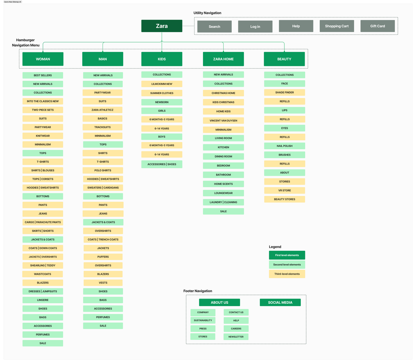
- Results supported placing Shade Finder under Foundation and keeping Sale accessible in the menu.
- Different interpretations of party clothing supported retaining Partywear within Collections.
- A task involving sportswear exposed a mismatch in how participants understood the route to pants.
- Home Kids was made reachable from Kids as well as the home collection.
05 · Prototyping & learning
Turn the structure into a shopping experience.
The team created low- and high-fidelity prototypes covering product discovery, sale browsing, and changing the size of a cart item.
Further usability testing of the high-fidelity prototypes remained a next step. The project reinforced the importance of connecting visual intent, everyday language, and evidence about how people expect content to be organized.