01 · The brief
Balance learning goals with the organization’s needs.
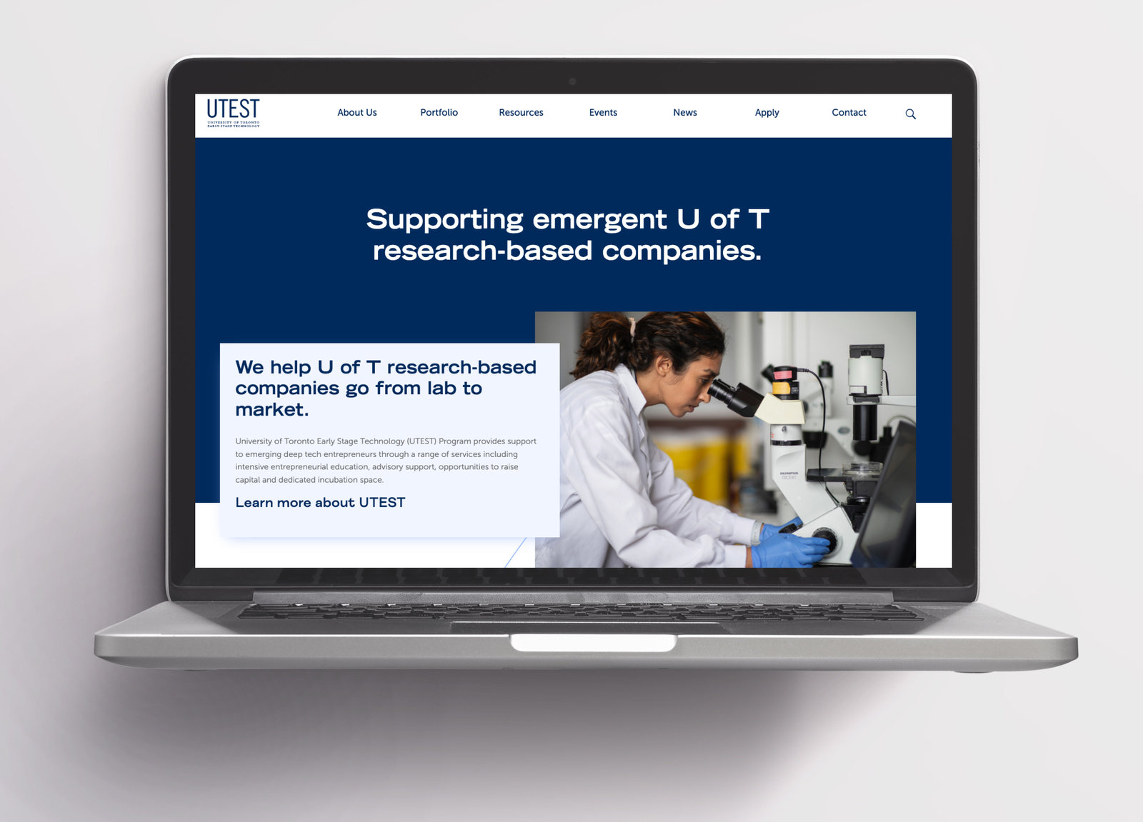
During my UTEST practicum, I reviewed the website from several perspectives: accessibility, usability principles, and the tasks visitors needed to accomplish.
The work combined automated and manual checks, a heuristic evaluation, a usability-testing plan, interviews, and synthesis. I then translated findings into recommendations and proposed page changes in Figma.
02 · Audit & expert review
Combine automated checks with a closer look.
The accessibility audit used WAVE, a colour-contrast checker, and manual code review. A separate evaluation used Nielsen’s ten heuristics to organize usability issues and recommendations.
Issues included unclear hover and active-page feedback, inconsistent link behavior, unfamiliar language, and weak form-entry constraints. The review connected each observation to a practical recommendation.
The review produced a documented set of accessibility and usability recommendations.
03 · Usability study
Test the tasks that matter to different visitors.
Four participants explored team information, startup discovery or application details, and newsletter subscription. The task variations reflected the different needs of students and investors.
- 4
- study participants
- 3
- evaluation approaches
- 2023
- practicum year
| Finding | Recommendation |
|---|---|
| All four expected team information under About Us. | Move or clearly link the team information there. |
| Investors struggled to reset startup filters. | Add a visible Reset All control. |
| Both students could not find application-process information. | Explain the process and eligibility on the application page. |
| Expired events could be mistaken for upcoming opportunities. | Separate upcoming and past events. |
| Newsletter frequency was unclear. | Explain that it is released quarterly. |
04 · Recommendations
Make the evidence usable for the team.
I organized the findings into actionable changes across the About, Portfolio, Apply, Events, and footer sections. Proposed redesigns explored clearer information placement, more discoverable startup search, and better feedback for navigation and forms.
The full report brings the audit, heuristic review, testing findings, limitations, and design directions together.
05 · What I learned
A useful scope can change as you learn.
I initially expected to redesign the whole website. As I learned more about access and implementation constraints, I adjusted the goals to focus on research, evaluation, and practical proposals.
The practicum gave me experience planning interviews, conducting an in-depth accessibility review, and synthesizing findings into recommendations that an organization could use.