01 · The challenge
Availability is only one part of access.
My Lil’ Healthbot was introduced at the University of Toronto’s Robarts Library to provide over-the-counter and hygiene products. Our team explored how people with low vision, colour blindness, or blindness could use it more independently.
My contribution included background research into visual-access barriers, analysis of the existing kiosk, and participation in expert feedback. We considered the physical setting and the sensitivity of purchasing health products alongside the interface.
02 · Research
Understand the whole interaction.
We reviewed literature, the company’s case study, and accounts shared in forums and videos by people using ATMs and touchscreen kiosks. We also researched existing accessibility approaches for self-service terminals.
- Finding the kiosk: signage, lighting, and obstacles can affect whether a service is discoverable.
- Reading and navigating: small content, glare, reliance on colour, and visual-only information can prevent access.
- Completing a private task: needing someone else’s assistance can expose product choices or payment information.
- Learning the interface: inconsistent layouts add effort, particularly in a busy public setting.
This research informed the concept, but it did not replace direct usability testing with people from the intended audience.
03 · The redesign
Combine physical, tactile, and digital changes.
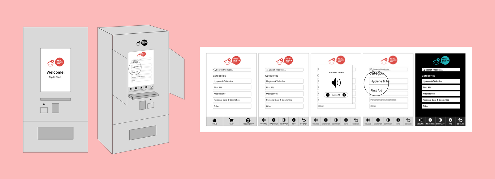
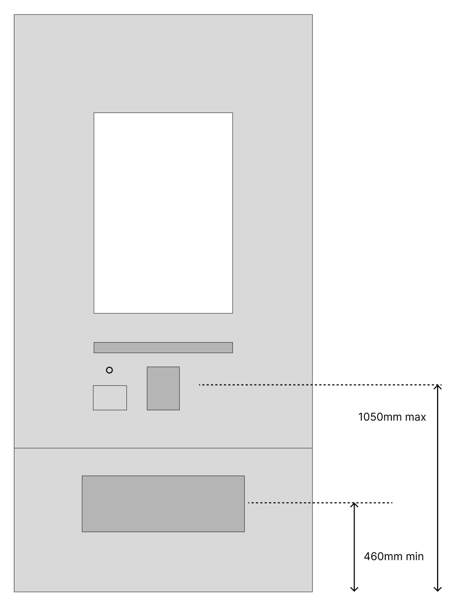
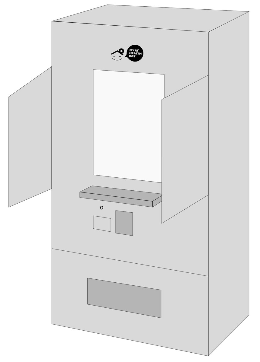
The concept included a tactile keyboard, a braille card reader, headphone access, anti-reflective treatment, and a smaller touchscreen. Privacy shields and the placement of controls were considered as part of the same service experience.
Offer more than one way to read and navigate.
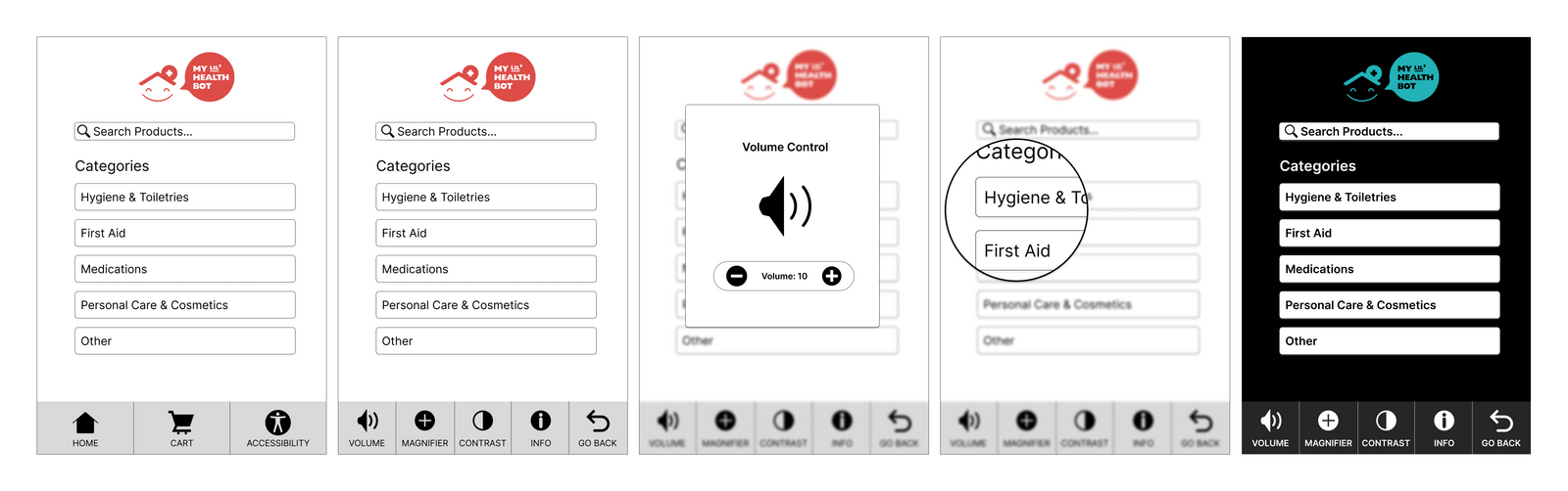
The accessibility menu explored volume adjustment, contrast options, and magnification. The design also proposed drag-to-read interaction and richer product information.
Help students find free alternatives.
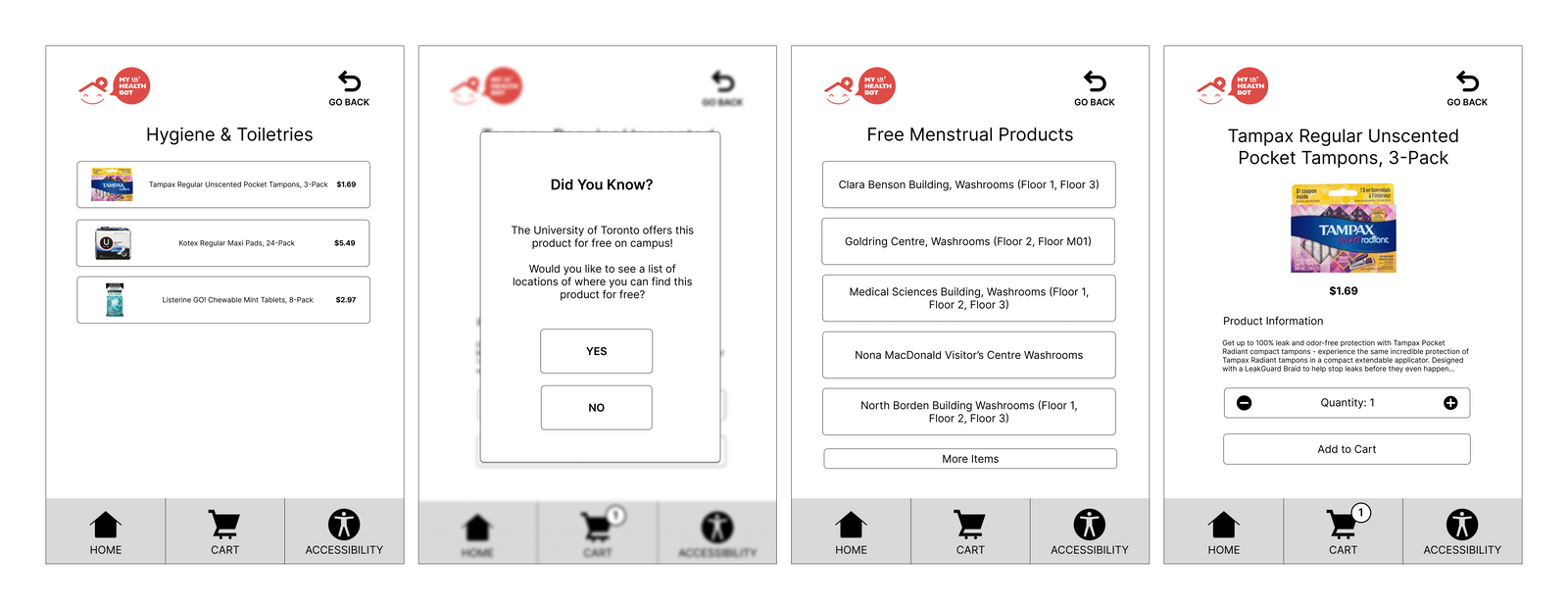
When a product was available free elsewhere on campus, the concept showed relevant locations so the kiosk did not become the only route to access.
04 · Expert feedback
An accessibility feature can create another barrier.
Adrian Petterson and Nandita Gupta reviewed the concept through walkthrough tasks covering accessibility settings and product purchases.
Their feedback led to concrete recommendations:
- Extend privacy shields fully rather than creating an obstacle at partial height.
- Add shortcuts for returning users, including adding products directly from the list.
- Explore speech input alongside the proposed interaction options.
- Reconsider the motion sensor: detection could exclude shorter users and introduce privacy concerns.
05 · What I learned
Evaluate the trade-offs around the feature.
The exercise showed why accessibility has to be considered across the environment, hardware, content, and interaction. A feature intended to help can also create an obstacle elsewhere.
The outcome remained a design concept with expert feedback. Direct co-design and testing with people with visual impairments would be essential to develop it further.